


Tutorial #1: iterate scraping & two different plots
Dive into it with R!

If you read my last Substack article or saw my last couple of tweets, you will have stumbled into two different plots I’ve made with data I’ve gathered from pbp.stats.com.
There are probably different and more efficient ways to do the stuff I did, but anyway, here’s how I did it with R Studio:
First of all, we need to load the packages needed to proceed. If you don’t have those, you will need to install them.
library(jsonlite)
library(data.table)
library(ggplot2)
library(dplyr)
library(RColorBrewer)
jsonlite is needed to scrape data from the API of pbp.stats.com, data.table is used to access more useful functions to use on data frames, ggplot2 is of course used to plot our two charts, and dplyr is the well-known package for data manipulation.
RColorBrewer was my personal choice for the palette of the second plot, but this is not mandatory, and you can always choose the palette package you prefer to make your charts beautiful.
Let’s begin the real work: we want to get all the unique lineups that played each season from 2000/01 until today, because that’s how far we can go back on the website.
To do that, we’ll use an iterative function that will create a list of dataframes, in which every dataframe will contain all the lineups of a single season, and in the end, we will bind all the dataframes into one (11500 rows!).
# Create an empty list to store data frames for each season
dfs <- list()

# Iterate over each season from 2000-01 to 2022-23
for (season in seq(2000, 2022)) {
  # Construct the URL for the API request
  url <- sprintf("https://api.pbpstats.com/get-totals/nba?Season=%d-%02d&SeasonType=Regular%%2BSeason&Type=Lineup", season, season + 1 - 2000)

  # Fetch the JSON data from the API
  api <- read_json(url)

  # Extract the data frame from the API response
  df <- api[["multi_row_table_data"]]
  df <- Map(as.data.frame, df)
  df <- rbindlist(df, fill = TRUE)

  # Add a column to indicate the season
  df$season <- season + 1

  # Store the data frame in the list
  dfs[[season - 1999]] <- df
}

# Combine all data frames into a single data table
combined_df <- rbindlist(dfs, fill = TRUE)
At this point we will have around 240 different variables for each lineup, but in our case we just need a few of those to get our work done, so we create a separate data frame with the variables we need, and then we filtrate this data frame to show only the lineups that scored at least 50 three pointers in a season, and then we group the lineups by season and count those.
lineups_comb=combined_df%>%
  select(EntityId, Name, TeamAbbreviation, season, Minutes, FG3M, FG3A)%>%
  filter(FG3M>50)%>%
  group_by(season)%>%
  count()
It’s time to plot this as a time series, and we will do that like this:
lineups_comb%>%
  ggplot(aes(x=season, y=n))+
  geom_line(linewidth=1.5)+
  geom_point()
This is the most basic plot you will have, but we can make it a little bit fancier with some tweaks made possible by the ggplot package:
lineups_comb %>%
  ggplot(aes(x=season, y=n)) +
  geom_line(linewidth=1.5) +  # Add a line with a specified line width
  geom_point() +  # Add points to the plot
  labs(x="",  # Set an empty label for the x-axis
       y="Number of lineups",  # y-axis label
       title="Lineups with 50+ threes scored",  # plot title
       subtitle="Data since 2000-01 NBA season",  # plot subtitle
       caption="@ed_vergani | pbp.stats.com") +  # plot caption
  coord_fixed(ratio=1/6) +  # Set the aspect ratio of the plot
  scale_x_continuous(limits=c(2001, 2023), breaks = seq(2001, 2023, 2)) +  # Set the limits and breaks for the x-axis
  scale_y_continuous(limits=c(10, 50), breaks = seq(10, 50, 5)) +  # Set the limits and breaks for the y-axis
  theme(axis.title.x = element_text(vjust=0, size=13, face="italic", family="Archivo"),  # Customize the x-axis title
        axis.title.y = element_text(vjust = 2, size = 13, face="italic",family="Archivo"),  # Customize the y-axis title
        plot.caption = element_text(color = 'gray40', size=8, family="Archivo"),  # Customize the plot caption
        plot.title=element_text(face="bold", size=20,family="Archivo"),  # Customize the plot title
        plot.subtitle = element_text(size=12,family="Archivo"),  # Customize the plot subtitle
        axis.text=element_text(size=16, family="Archivo"),  # Customize the axis text
        axis.text.x = element_text(angle = 50, vjust = 1, hjust = 1),  # Customize the angle and position of x-axis text
        legend.position = "none",  # Remove the plot legend
        panel.grid = element_line(color = "#afa9a9"),  # Customize the color of the grid lines
        plot.background = element_rect(fill = '#efe8e8', color = '#efe8e8'),  # Customize the plot background color
        panel.background = element_rect(fill = '#efe8e8', color = '#efe8e8'),  # Customize the panel background color
        panel.grid.minor = element_blank(),  # Remove the minor grid lines
        axis.line = element_line(linewidth = 0.5, colour = "black", linetype=1),  # Customize the axis lines
        plot.margin = margin(t = 1, r = 0.5, b = 1, l = 0.5, unit = "cm"))  # Set the plot margin dimensions
These are my personal customizations, but you can get a better grasp on it by looking for the different parameters on the ggplot guides you can find on the internet, such as this great one.
We can then save the plot as a proper HD png with the following function:
ggsave("lineups3s.png", width = 12, height = 6, dpi = 300, type = 'cairo')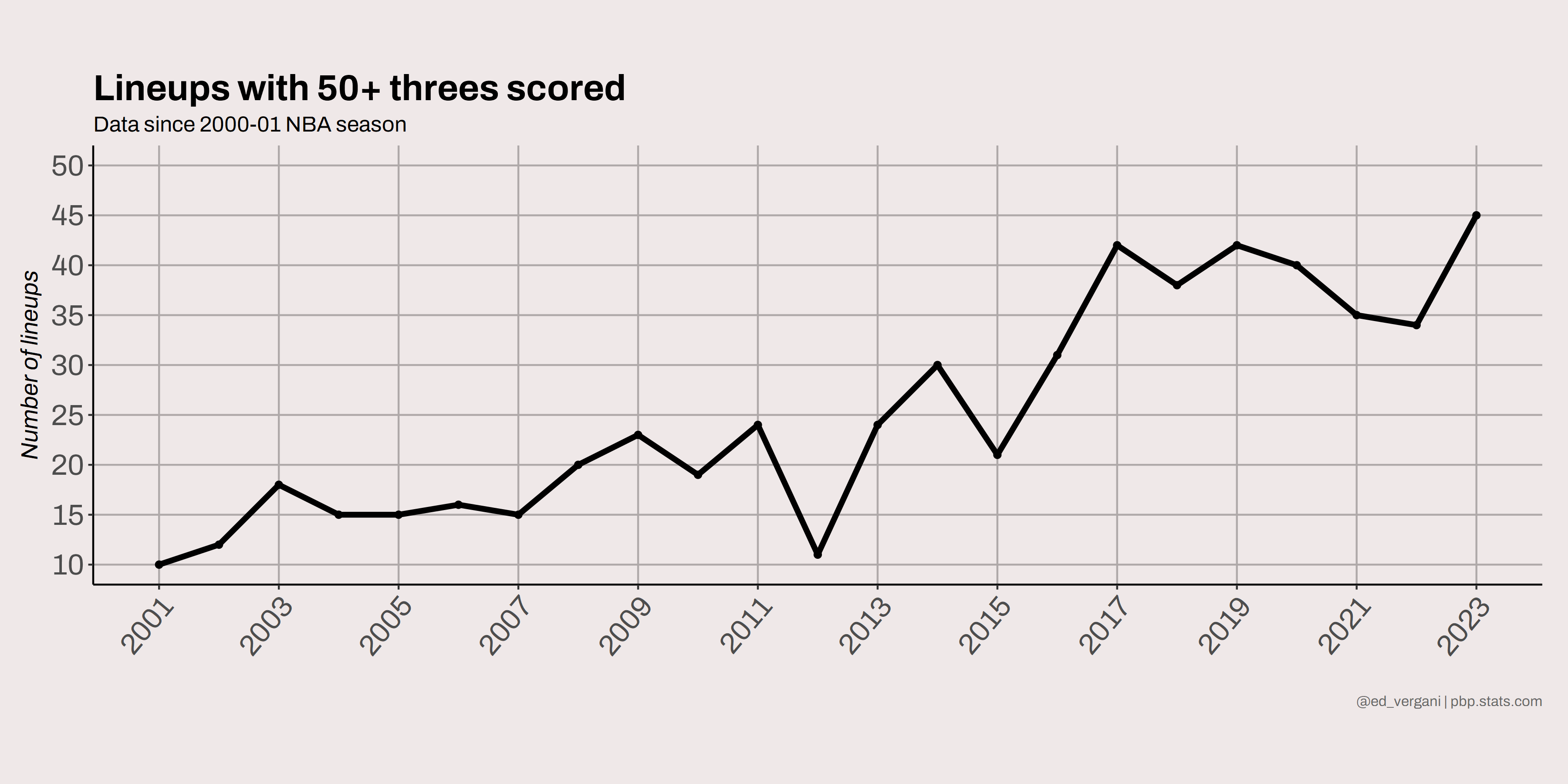
For the second and final plot, we need to follow a slightly different procedure. Firstly, we create a new dataframe from the original one and add two new variables which are calculated by R:
lineups=combined_df%>%
  select(EntityId, Name, TeamAbbreviation, season, Minutes, FG3M, FG3A)%>%
  filter(FG3M>50)%>%
  mutate(permin=(FG3M/Minutes)*36, perc=FG3M/FG3A)
The new dataframe will contain nine variables and approximately 580 rows, where each row represents a lineup capable of scoring 50+ treys in a season.
Now, we can proceed to plot the scatterplot of this data.
lineups%>%
  ggplot(aes(x=season, y=permin, color=season))+
  geom_point(size=1.5, alpha=0.9)
After completing the initial basic steps, our plot will look like this:

This doesn’t look very good, so why don’t we work on it a little bit to make it look good?
lineups%>%
  ggplot(aes(x=season, y=permin, color=season))+
  geom_point(size=1.5, alpha=0.9)+
  geom_smooth(method="loess", se=T, color="gray30", linetype="dashed", alpha=0.4, linewidth=0.6)+
  scale_color_distiller(palette = "Set1")+
  coord_fixed()+
  scale_x_continuous(limits=c(2001, 2023), breaks = seq(2001, 2023, 2))+
  scale_y_continuous(limits=c(2.2, 16.2), breaks = seq(2, 16, 2))
In general, the geom_smooth() function is utilized to incorporate a fitted line or smoothed curve into a scatterplot to display correlations or trends between variables. The method argument specifies the type of smoothing to be employed, and other arguments can be applied to modify the curve's appearance.
Despite this, the current plot may still be unclear, so we will move forward with customization
lineups%>%
  ggplot(aes(x=season, y=permin, color=season))+
  geom_point(size=1.5, alpha=0.9)+
  geom_smooth(method="loess", se=T, color="gray30", linetype="dashed", alpha=0.4, linewidth=0.6)+
  scale_color_distiller(palette = "Set1")+
  coord_fixed()+
  scale_x_continuous(limits=c(2001, 2023), breaks = seq(2001, 2023, 2))+
  scale_y_continuous(limits=c(2.2, 16.2), breaks = seq(2, 16, 2))+
  labs(x="",
       y="Threes per 36 minutes",
       title="Lineups: Threes per 36 minutes",
       subtitle="Since 2000-01 NBA season, 50+ FG3M | Efficency and frequency has grown a lot!",
       caption="@ed_vergani | pbp.stats.com")+
  theme(axis.title.y = element_text(vjust = 2, size = 11, face="italic",family="Archivo"),
        plot.caption = element_text(color = 'gray40', size=6, family="Archivo"),
        plot.title=element_text(face="bold", size=20,family="Archivo"),
        plot.subtitle = element_text(size=8,family="Archivo"),
        axis.text=element_text(size=10, family="Archivo"),
        axis.text.x = element_text(angle = 50, vjust = 1, hjust = 1),
        legend.position = "none",
        panel.grid = element_line(color = "#afa9a9"),
        plot.background = element_rect(fill = '#efe8e8', color = '#efe8e8'),
        panel.background = element_rect(fill = '#efe8e8', color = '#efe8e8'),
        panel.grid.minor = element_blank(),
        axis.line = element_line(linewidth = 0.5, colour = "black", linetype=1),
        plot.margin = margin(t = 1, r = 0.5, b = 1, l = 0.5, unit = "cm"))
This is the final chart:

As a result, you will have two plots and two dataframes that you can use as per your requirements for analyzing lineups!